We live in a busy and noisy world, bombarded with tens of thousands of messages daily, each craving for our attention. We have previously offered a quick overview and list of vacation rental blogs competing for North Myrtle Beach online visitors' attention. They all look pretty much the same and tackle pretty much the same topics in a very similar manner.
All these blogs are just like people singing in a choir. The question is: how do you stand out from the crowd? The solution we propose is a combination of three factors: design-content-promotion. Today's blog post will analyze the first one: the design and overall look of a successful vacation rentals blog.
Here are a few of the most important design and layout aspects you need to pay attention to if you want to equip your vacation rental business with an effective blog:
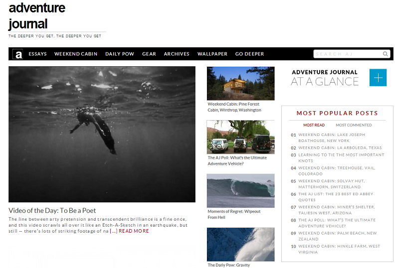
- Use big pictures – we live in a visual world and people love to get the message quickly. There is no better way to make a travel blog attractive than using big, colorful, meaningful pictures. Too many vacation rental companies in North Myrtle Beach have set up their blog on a narrow layout so there is no room for good pictures. Small pictures surrounded by text scare online visitors away. Here is an example of one of the most successful travel blogs, adventure journal:

- Use a wide layout – this is in direct connection with the previous point, about pictures. There is no way to use big pictures on a narrow layout. A travel blog needs to offer enough space for both text and pictures and it might not be a bad idea for the vacation rental companies in North Myrtle Beach to make room for even more information about the beach houses or hotel condos they rent.
- Add a list of most popular posts and link to them – your blog is supposed to publish articles on many interesting and useful aspects for vacationers so it makes perfect sense to offer them easy access to a handful of such posts (see above example).
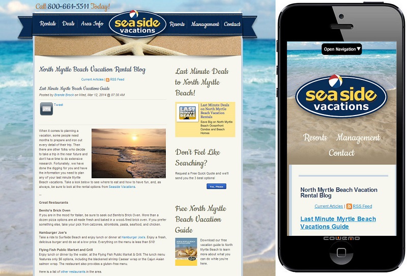
- Use a responsive layout – we live in a quick-paced world and many people made of habit of accessing information on their mobile devices. A responsive layout for your vacation rental blog will make sure people can easily read your blog posts on their device no matter what hey are. The responsive layout will display the layout nicely on any device and screen, resizing the fonts and images. North Myrtle Beach vacation rental companies might not experience such an intense traffic on their blogs from mobile devices, since the North Myrtle Beach market demographics is different than Myrtle Beach, being tilted more toward seniors. Our research showed that most visitors use laptops to get online while vacationing in North Myrtle Beach and they use their mobile phones to just… talk. But there is still a certain percentage of visitors to North Myrtle Beach using tablets and from a technology standpoint, many such tablets are treated as mobile devices, hence a need for a responsive layout.

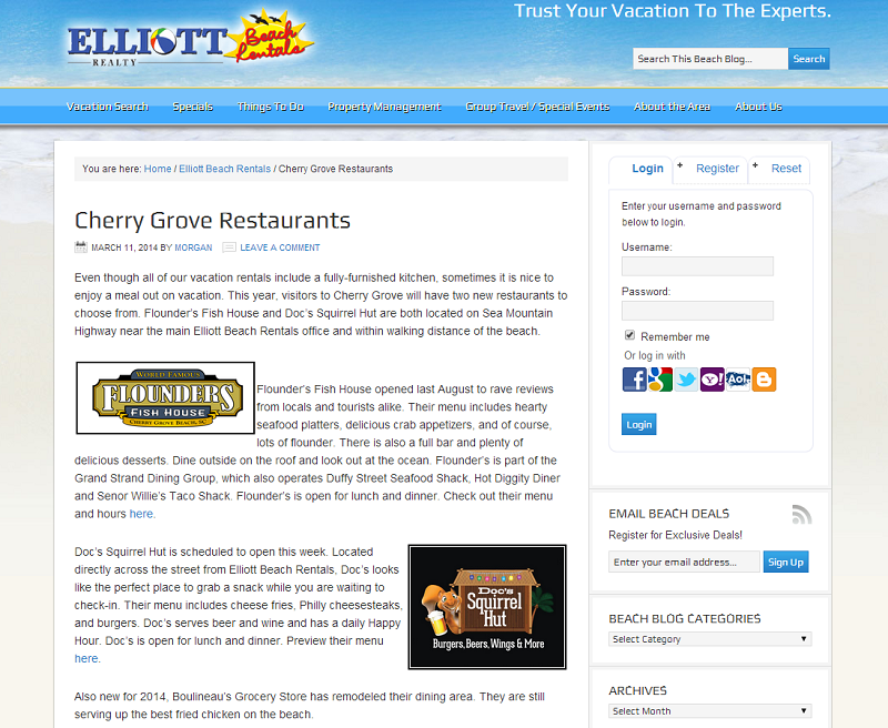
- Use warm colors for the layout – your blog is about vacationing in North Myrtle Beach so it make sense to adopt warm, happy, bright colors for the layout of the blog. Don’t use a business template for the blog, since colors used for business online presence are usually cold and uptight. On the other hand, you don’t want to overdo things and turn your vacation rental blog into a circus. Be consistent and use common sense when choosing the colors for the layout, making sure you give the blog a similar feeling as the regular website. This way people would still be able to connect it to your general online presence and brand. Here is how Elliott Beach Rentals is using the color of the sand as a generic background color for their vacation rentals blog:

- Add all the regular bells and whistles – make sure you add social media icons to link to your social profiles, a lead capture form, contact details, etc. The blog is another online interface for your vacation rental business besides your regular web site so you should treat is with similar care and attention to details.
- Use easy-to-read mid-size fonts – make it easy for people to read the content of your blog. We have seen many travel blogs using serif fonts. They might look elegant and fancy, but they distract and make it hard for online visitors to read the blog. You don’t have many options with regard to fonts since web browsers usually use average fonts installed by default on computers. Don’t use a fancy font you have installed on your computer because online visitors won’t see the text in the same font. There is a way around this, though: use Google fonts. You can refer in your blog to the online fonts offered for free by Google so that every web browser would first download the specified font and use it to display your blog. The downside of this approach is that it add to the loading time of your blog which, on a poor internet connection, might have significant negative impact.
You have no longer than 20 seconds to make a first good impression, recent research showed. The layout and the design of your vacation rental blog is crucial to convincing people to spend more time on the blog and read the posts. Follow the guidelines presented above and you will place your blog among those who stand out and drive online traffic. We will continue our series with more details on the quality of the content posted on vacation rental blogs.